Healing Arts
Backstory
Leslie Forsyth, the owner of Healing Arts, is my mom. Most of my life she has been the breadwinner of the household and for years she has owned her own business. She shared her entrepreneurial spirit with me and has always shown that she, and therefore I, can overcome any obstacles placed in her path.
The Site
We had two main goals with the Healing Arts website:
1) Highlight the owner, Leslie Forsyth, and her unique personality, and 2) Describe complex therapies in a simple, warm, human story that anyone can relate to.
Please excuse the baseball reference, but I can’t think of any other way to say that I think we knocked both of those out of the park. I am so incredibly proud of what we created. You can look at the site at https://www.leslieforsyth.com.
Highlight the Owner
To us, the most important aspect of any business, and especially one providing a service, is the people. We wanted to show that you won’t be dealing with just another corporation, but rather directly with Leslie Forsyth. So we put Leslie’s picture right on the home page, showing her warm, welcoming smile. We wanted to show that you will be forming a relationship with a person when you give Leslie a call.
Tell a Story about Complex Things
Leslie’s work focuses on systems at work inside the body that you may have never heard of before and we had a vision of educating you about them in a warm, human way. We didn’t want the site to look like a text book with ugly colors and hand drawings. We wanted to tell the story without losing the human warmth.
Each therapy has its own story and each story has three parts, an overview of the bodily system and what it does, a simple explanation of how the therapy works, and why you would be interested in a session.
We purposefully avoided jargon and worked to keep the language simple. Not because we think that visitors to the site are dumb, but because we know that they are busy and want information as quickly and easily as possible.
Creating a Logo
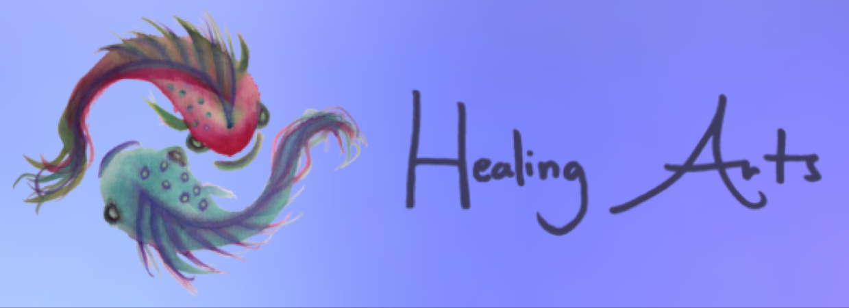
While creating the site we also created a logo. The logo used on the website is a combination of Chinese brush painted fish that Leslie painted and her hand-written “Healing Arts.” We cleaned her creations up a bit to look good on the screen, but our intent was to find yet another way to show her personality and put her fingerprint on her work.
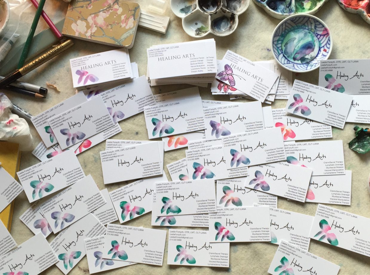
We also redid her business cards to ensure a consistent feel between the cards and the site. The cards only have the text part of the logo. She hand paints a butterfly on each card and the combination of the new logo and the painting looks fabulous.
Technical Details
This site is hand built in standards compliant HTML and CSS and served statically from the same server we use for our site. What that means is that the pages are quick to load resulting in a great experience for potential customers. While we’re happy to build sites on other platforms like Wordpress and Squarespace, this is our preferred method of creating them. We have total control over the performance and styling and the business owner doesn’t have to worry about anything.
Some Numbers
We spent way more time on this site than we expected to but when you have a vision you have to follow it. Our policy is to only charge our estimated amount at max so Leslie didn’t have to worry about the budget going up half way through the project and we were able to see our vision come to reality.
In total we spent 138.5 hours on this project with some of the more time consuming parts being taking and editing most of the photos on the site and making sure that it looks great on every device. We also spent some time laying the groundwork for the next phase of her site which will feature her artwork.


